Introduction
CSS positioning and layout tools have come a long way — and with them, the way we think about building web interfaces has completely evolved. Whether you’re working on a personal project or diving into production-ready components, understanding the core layout concepts in CSS is essential for writing clean, scalable front-end code.
This post offers an overview of the foundational CSS properties and layout behaviors that affect how elements are spaced, stacked, aligned, and displayed. We’re not going deep into step-by-step tutorials here — the goal is to give you a mental map of what’s out there, how different positioning strategies compare, and why certain tools are better suited for specific situations.
We’ll touch on everything from classic box model spacing (margin and padding) to modern layout techniques like Flexbox and Grid, along with key properties that control visibility, stacking, and layout behavior. You’ll also find insights into transform effects, overflow control, and the role of CSS variables in creating more flexible stylesheets.
To tie everything together, there’s a live HTML demo that showcases the concepts discussed here. You can explore that example after reading to see how these techniques work in practice.
Let’s take a look at the landscape of CSS layout — what’s possible, when to use what, and how to think about positioning with confidence.
Centering Elements: Margin Auto & Flexbox
Centering is one of the first layout challenges most developers face. The good news is that CSS has matured to give us a few reliable ways to handle it. Two of the most common methods are using margin auto and using Flexbox.
Margin auto is typically used to center block-level elements horizontally. This works when the element has a defined width and is placed inside a container. It’s simple and widely supported. However, this method only handles horizontal centering and doesn’t help if you need to center something vertically.
Flexbox, on the other hand, makes centering much easier and more flexible. By setting a parent container to use Flexbox, you can align items both horizontally and vertically. This is ideal for layouts where you need dynamic centering, like modal popups or sections that need to remain centered on different screen sizes. It’s also more responsive-friendly than margin auto.
In general, use margin auto when you’re working with fixed-width elements in static layouts. Reach for Flexbox when you need full control over alignment in multiple directions or when your layout needs to adjust across devices.
Code example:
.center-demo {
 background: #f5f5f5;
 padding: 20px;
 margin-bottom: 20px;
}

.center-block {
 width: 200px;
 height: 100px;
 background: #4caf50;
 color: white;
 margin: 0 auto;
 display: flex;
 align-items: center;
 justify-content: center;
}
Margin and Padding
Margin and padding both deal with spacing, but they serve different purposes and affect layout in different ways.
Padding is the space inside the element, between the content and the element’s border. Use it to create breathing room around text or content within a box. For example, padding can make buttons more clickable by increasing their touch area without changing their visual layout too much.
Margin is the space outside the element, separating it from other elements. It’s useful for layout spacing, like pushing elements apart or creating space between sections.
One thing to watch out for is margin collapse, where vertical margins between elements can combine into a single margin rather than stacking. This can be surprising at first, but it’s part of how CSS handles layout flow.
When in doubt: use padding to create internal space, and use margin to separate elements from one another.
Code example:
.spacing-demo {
  background: #e0e0e0;
  padding: 20px;
  border-radius: 8px;
}
.box-container {
  display: flex;
  gap: 40px;
  margin: 20px 0;
  justify-content: center;
}
.box-wrapper {
  position: relative;
  width: 400px;
}
.spacing-box {
  background: #fff;
  width: 100%;
}
/* Margin Box */
.margin-example {
  background: rgba(33, 150, 243, 0.1);
  padding: 20px;
  position: relative;
}
.margin-box {
  margin: 30px;
  background: #2196f3;
  color: white;
  text-align: center;
  padding: 20px;
}
/* Margin Indicators */
.margin-indicator {
  position: absolute;
  color: #1976d2;
  font-size: 0.8em;
  display: flex;
  align-items: center;
  justify-content: center;
}
.margin-top {
  top: 15px;
  left: 50%;
  transform: translateX(-50%);
}
.margin-bottom {
  bottom: 15px;
  left: 50%;
  transform: translateX(-50%);
}
.margin-left {
  left: 15px;
  top: 50%;
  transform: translateY(-50%);
}
.margin-right {
  right: 15px;
  top: 50%;
  transform: translateY(-50%);
}
/* Padding Box */
.padding-example {
  background: rgba(76, 175, 80, 0.1);
  padding: 20px;
  position: relative;
}
.padding-box {
  background: #4caf50;
  color: white;
  text-align: center;
}
.padding-content {
  padding: 30px;
  border: 2px dashed rgba(255, 255, 255, 0.5);
}
/* Padding Indicators */
.padding-indicator {
  position: absolute;
  color: #2e7d32;
  font-size: 0.8em;
  display: flex;
  align-items: center;
  justify-content: center;
}
/* Labels */
.label {
  text-align: center;
  font-weight: bold;
  margin: 10px 0;
  color: #333;
}
/* Arrows */
.arrow {
  position: absolute;
  border-top: 2px solid;
  width: 30px;
}
.margin-box .arrow {
  border-color: #1976d2;
}
.padding-box .arrow {
  border-color: #2e7d32;
}
/* Interactive hover effects */
.margin-box {
  transition: margin 0.3s ease;
}
.padding-content {
  transition: padding 0.3s ease;
}
.margin-example:hover .margin-box {
  margin: 40px;
}
.padding-example:hover .padding-content {
  padding: 40px;
}Element with Margin
Margin creates space outside the element
Element with Padding
Padding creates space inside the element
Flexbox Layout
Flexbox is one of the most versatile layout systems in CSS. It’s designed for one-dimensional layouts — that means it works best when you’re aligning items in a single row or a single column.
The core idea is that a parent container becomes a flex container, and its direct children become flex items. From there, you can control how those children are distributed, aligned, and wrapped.
Flexbox is great for building navigation bars, card layouts, or any situation where you need consistent spacing and alignment without relying on floats or manual positioning. You can also change the direction of layout — from row to column — depending on the screen size or design needs.
Use Flexbox when you need quick and responsive alignment, especially for layouts that only go in one direction at a time. For more complex two-dimensional layouts, Grid is a better fit.
Code example:
.flex-container {
  background: #f5f5f5;
  display: flex;
  gap: 10px;
  margin: 20px 0;
  flex-wrap: wrap;
}

.flex-item {
  flex: 1 1 200px;
  padding: 20px;
  background: #2196f3;
  color: white;
  text-align: center;
}Grid Layout
CSS Grid is made for two-dimensional layouts — those that involve both rows and columns. It’s especially useful when you’re building sections that need precise control over element placement across both axes.
A grid container defines columns and rows, and you can place items into specific grid cells or let them automatically flow into the grid structure. You can also define how much space each column or row takes up, and how gaps between elements behave.
Grid works best for page layouts, content grids, and UI components that require a more structured design. It’s ideal for designs where elements need to line up in both directions, such as dashboard panels or card-based sections.
Use Grid when your layout needs structure in both rows and columns. For simpler row or column arrangements, Flexbox is typically more efficient.
Code example:
.grid-container {
  background: #f5f5f5;
  display: grid;
  grid-template-columns: repeat(4, 1fr);
  grid-template-rows: repeat(2, 100px);
  gap: 10px;
  margin: 20px 0;
}

.grid-item {
  background: #9c27b0;
  color: white;
  display: flex;
  align-items: center;
  justify-content: center;
}

.span-two {
  grid-column: span 2;
}Position Properties
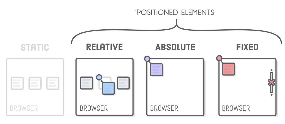
CSS offers several ways to position elements on the page, each with its own use case.
By default, elements are positioned statically, meaning they appear in the normal document flow. The relative value allows you to nudge elements around without removing them from the flow, which is helpful for fine-tuning positioning.
Absolute positioning removes the element from the normal flow entirely and places it relative to the nearest positioned ancestor. This gives full control over placement, but it can lead to unexpected overlaps if not managed carefully.
Fixed positioning anchors the element to the viewport, so it stays in place as the user scrolls. This is useful for headers, sidebars, or floating buttons.
Sticky positioning is a hybrid that keeps the element in the flow until a certain scroll point is reached, at which point it “sticks” to a defined position. This is great for sticky headers or navigation bars.
Each position type has strengths and trade-offs. Use static and relative for simple layouts, absolute for overlays or manual placements, fixed for persistent UI elements, and sticky for elements that should shift between relative and fixed as users scroll.
Transform Effects
CSS transform allows you to visually manipulate elements without changing their actual position in the document flow. You can move, rotate, scale, or skew elements using just one property.
The most common use is translating an element along the X or Y axis, often used for animations or centering tricks. Scaling is another popular use, like making a button grow slightly when hovered. Rotation and skewing are less common but useful for creating dynamic, attention-grabbing designs.
Transformations don’t affect the element’s surrounding layout, which makes them great for effects and interactions. You can also combine multiple transforms in a single declaration, though stacking them can sometimes get tricky.
Use transforms when you want to visually adjust an element or create simple animations without touching its layout behavior.
Code example:
.transform-container {
  display: grid;
  grid-template-columns: repeat(auto-fit, minmax(200px, 1fr));
  gap: 20px;
  padding: 20px;
  background: #f8f9fa;
}

.transform-box {
  width: 150px;
  height: 150px;
  margin: 20px auto;
  background: #2196f3;
  display: flex;
  align-items: center;
  justify-content: center;
  color: white;
  cursor: pointer;
  transition: transform 0.3s ease, background-color 0.3s ease;
  position: relative;
}

.transform-label {
  text-align: center;
  margin: 10px 0;
  font-weight: bold;
  color: #333;
}

/* Scale Transform */
.scale-box:hover {
  transform: scale(1.2);
  background: #1976d2;
}

/* Rotate Transform */
.rotate-box:hover {
  transform: rotate(45deg);
  background: #1976d2;
}

/* Translate Transform */
.translate-box:hover {
  transform: translate(20px, -20px);
  background: #1976d2;
}

/* Skew Transform */
.skew-box:hover {
  transform: skew(20deg, 10deg);
  background: #1976d2;
}

/* Multiple Transforms */
.multiple-box:hover {
  transform: scale(1.1) rotate(45deg) translateY(-10px);
  background: #1976d2;
}

/* 3D Transform */
.perspective-container {
  perspective: 1000px;
  width: 150px;
  height: 150px;
  margin: 20px auto;
}

.rotate3d-box {
  width: 100%;
  height: 100%;
  background: #2196f3;
  display: flex;
  align-items: center;
  justify-content: center;
  color: white;
  cursor: pointer;
  transition: transform 0.3s ease, background-color 0.3s ease;
}

.rotate3d-box:hover {
  transform: rotate3d(1, 1, 1, 45deg);
  background: #1976d2;
}Z-index and Stacking
In CSS, elements are layered on top of one another based on their order in the document and their positioning. The z-index property controls the stacking order when elements overlap.
Z-index only works on elements that have a position value other than static. Once positioned, an element’s z-index can be increased or decreased relative to its siblings. A higher z-index means the element appears on top.
One common issue is that z-index doesn’t always behave as expected because stacking context can be affected by parent elements. A stacking context is basically a group of elements where z-index values only apply within that group. Creating new contexts — intentionally or not — can interfere with layering.
Use z-index to control layering of overlays, modals, tooltips, dropdowns, and other UI elements that sit on top of the main content.
Code example:
.z-index-demo {
  height: 200px;
  position: relative;
  background: #f5f5f5;
  margin: 20px 0;
}

.z-box {
  position: absolute;
  width: 100px;
  height: 100px;
  display: flex;
  align-items: center;
  justify-content: center;
  color: white;
}

.z-box-1 {
  background: rgba(244, 67, 54, 0.8);
  left: 20px;
  top: 20px;
  z-index: 1;
}

.z-box-2 {
  background: rgba(33, 150, 243, 0.8);
  left: 60px;
  top: 60px;
  z-index: 2;
}

.z-box-3 {
  background: rgba(76, 175, 80, 0.8);
  left: 100px;
  top: 100px;
  z-index: 3;
}Overflow Properties
When an element’s content is larger than its container, the overflow property defines what happens to that extra content. The most common values are visible, hidden, scroll, and auto.
By default, overflow is visible, which can lead to content spilling outside its box. Setting overflow to hidden clips the content, while scroll adds scrollbars to let users access everything. Auto adds scrollbars only when necessary.
This property is particularly useful for text containers, image galleries, or any box with fixed dimensions. It’s also essential when working with layouts that include sticky or fixed-position children, since overflow behavior can affect stacking and visibility.
Use overflow to manage how content behaves when it doesn’t fit, especially in controlled or responsive layouts.
Code example:
.overflow-demo {
  display: flex;
  gap: 20px;
  margin: 20px 0;
}

.overflow-box {
  width: 150px;
  height: 150px;
  border: 2px solid #9e9e9e;
  padding: 10px;
}

.overflow-visible {
  overflow: visible;
}
.overflow-hidden {
  overflow: hidden;
}
.overflow-scroll {
  overflow: scroll;
}
.overflow-auto {
  overflow: auto;
}
Visible
This is some overflowing text that demonstrates the overflow: visible property. Some more text...Hidden
This is some overflowing text that demonstrates the overflow: hidden property. Some more text...Scroll
This is some overflowing text that demonstrates the overflow: scroll property. Some more text...Auto
This is some overflowing text that demonstrates the overflow: auto property. Some more text...Box Sizing Comparison
CSS has two main box models: content-box and border-box. These define how the browser calculates the total size of an element.
In the default content-box model, width and height only include the content — padding and borders are added on top of that, increasing the final size. In contrast, the border-box model includes padding and borders within the specified width and height, making sizing much easier to predict.
Most developers now use border-box as the standard because it simplifies layout math and avoids layout shifts. It’s often applied globally using the universal selector.
Understanding the difference helps you write more consistent and reliable CSS, especially when working with complex nested layouts.
Code example:
.box-sizing-container {
  display: flex;
  gap: 40px;
  margin: 20px 0;
}

.box-example {
  width: 250px;
  background: #fff;
  border: 2px solid #333;
}

.box-header {
  background: #333;
  color: white;
  padding: 10px;
  text-align: center;
}

.box-content {
  padding: 20px;
  border: 10px solid #e91e63;
  background: #f8bbd0;
}

.content-box-example .box-content {
  box-sizing: content-box;
  width: 200px;
}

.border-box-example .box-content {
  box-sizing: border-box;
  width: 200px;
}

.size-label {
  margin-top: 10px;
  text-align: center;
  font-size: 0.9em;
  color: #666;
}Display Properties
The display property determines how an element behaves in the layout. There are several key values, each with its own use case.
Block elements take up the full width of their parent and start on a new line. Examples include divs and paragraphs. Inline elements, like spans, don’t start on a new line and only take up as much width as their content needs. Inline-block combines both behaviors — it sits inline with other content but respects height and width.
None removes the element from the layout entirely, while Flex and Grid turn the element into a layout container with powerful child alignment features.
Use display to control how elements flow within the layout. It’s especially important when converting default HTML behavior into something more tailored to your design.
Code example:
.display-container {
  margin: 20px 0;
  padding: 20px;
  background: #f5f5f5;
}

.display-type {
  margin: 20px 0;
}

.block-element {
  background: #bbdefb;
  border: 2px solid #1976d2;
  padding: 10px;
  margin: 10px 0;
}

.inline-element {
  background: #c8e6c9;
  border: 2px solid #388e3c;
  padding: 10px;
  margin: 0 5px;
}

.inline-block-element {
  display: inline-block;
  background: #fff9c4;
  border: 2px solid #fbc02d;
  padding: 10px;
  margin: 5px;
  width: 150px;
  height: 80px;
  vertical-align: middle;
}

.flow-text {
  margin: 10px 0;
  line-height: 1.6;
}
Block Elements
Inline Elements
Inline-Block Elements
Has width & height
Flows like inline
Respects dimensions
Visibility Properties
Visibility is often confused with display, but they behave differently. When you set visibility to hidden, the element is still in the layout and takes up space, but it’s not visible. With display set to none, the element is removed from the layout entirely.
Use visibility when you need to hide something temporarily without shifting the layout, like toggling content without causing layout jumps. Use display when you want to completely remove the element until it’s needed.
This distinction is key when working with dynamic interfaces or when hiding elements conditionally using JavaScript or media queries.
Code example:
.visibility-container {
  display: grid;
  grid-template-columns: repeat(auto-fit, minmax(250px, 1fr));
  gap: 20px;
  margin-top: 40px;
  background: #f8f9fa;
  padding: 20px;
  border-radius: 8px;
}

.visibility-example {
  background: white;
  padding: 20px;
  border-radius: 8px;
  box-shadow: 0 2px 4px rgba(0, 0, 0, 0.1);
}

.visibility-box {
  width: 100px;
  height: 100px;
  background: #4caf50;
  margin: 10px;
  display: inline-flex;
  align-items: center;
  justify-content: center;
  color: white;
  transition: all 0.3s ease;
}

.visibility-controls {
  margin: 10px 0;
  display: flex;
  gap: 10px;
}

.control-button {
  padding: 8px 16px;
  background: #2196f3;
  color: white;
  border: none;
  border-radius: 4px;
  cursor: pointer;
  transition: background-color 0.3s ease;
}

.control-button:hover {
  background: #1976d2;
}

.space-indicator {
  width: 100%;
  height: 2px;
  background: #ff5722;
  margin: 10px 0;
}
visibility: hidden
Space is preserved, element is hidden
display: none
Space is collapsed, element is removed from layout
opacity: 0
Space is preserved, element remains interactive
CSS Variables
CSS variables, also known as custom properties, allow you to store reusable values directly in your CSS. These can include colors, font sizes, spacing units, or even entire property sets.
They’re defined with two dashes and can be scoped globally or locally. What makes them especially useful is that they can be updated dynamically, even with JavaScript, allowing for real-time theming or responsiveness.
Variables help you keep your CSS consistent and maintainable. Instead of repeating the same value everywhere, you define it once and reuse it across your stylesheets. When updates are needed, you only have to change the value in one place.
Use variables to clean up your CSS and make future changes much easier.
Code example:
:root {
  --primary-color: #2196f3;
  --secondary-color: #4caf50;
  --accent-color: #ff5722;
  --spacing-unit: 16px;
  --border-radius: 8px;
  --transition-speed: 0.3s;
}
Preprocessor-style Nesting
CSS has evolved to support limited nesting, similar to what preprocessors like Sass have offered for years. Nesting allows you to write more concise styles by grouping related selectors together.
Instead of repeating the parent selector for every rule, you can nest child elements or pseudo-classes directly under it. This improves readability and makes it easier to manage components or sections with many states.
However, nesting too deeply can hurt readability and performance. Keep it shallow and use it to group styles logically, not to mirror your entire DOM structure.
Use nesting to simplify scoped styles, especially in component-based layouts or when working with utility-first design systems.
CSS Selectors
Selectors are how you target elements in CSS, and knowing the right ones can save you time and make your styles more efficient.
Basic selectors include element tags, classes, and IDs. Combinators like child (>), descendant (space), and sibling selectors (+ and ~) help you target elements in relation to others. Pseudo-classes like :hoover or :first-child let you style elements based on state or position.
Understanding specificity is key. When multiple rules apply to the same element, the one with higher specificity wins. Inline styles beat everything, and ID selectors are stronger than class selectors.
Use selectors thoughtfully to avoid unnecessary overrides and to keep your stylesheets organized and scalable.
Conclusion
CSS positioning and layout tools have come a long way, and today’s web developers have a powerful set of options for building flexible, responsive, and well-structured designs. Whether you’re tweaking a button alignment or building a full-page layout, understanding when and how to use each of these techniques gives you a strong foundation for any project.
This guide isn’t just about learning the syntax — it’s about making the right choices in the right context. Bookmark it, reference it, and use it as a foundation as you build out your own projects.